
Wheels Up
App (iOS, Android) and website redesign.
Systems design and documentation, UI/UX design, user testing
Overview
Wheels Up is a private aviation company that facilitates on-demand booking of private jets for individuals, families, and businesses. They also offer flight deals, and a variety of benefits and events with the purchase of a membership.
Problem
The world of Private Aviation was an antiquated one, where the majority of our members still booked flights by calling into our Flight Services team. Without a membership, you weren't able to browse the app and search for flights freely. Not only this, but upon conducting user interviews, some members expressed concerns about making such large purchases through an app or website.
The app itself was a bit outdated. Searching for flights was difficult, and the way it was laid out made it hard to compare prices. With little to no user information to start from, we worked with our internal Member Services team to get feedback about what our members were writing to them about for help.
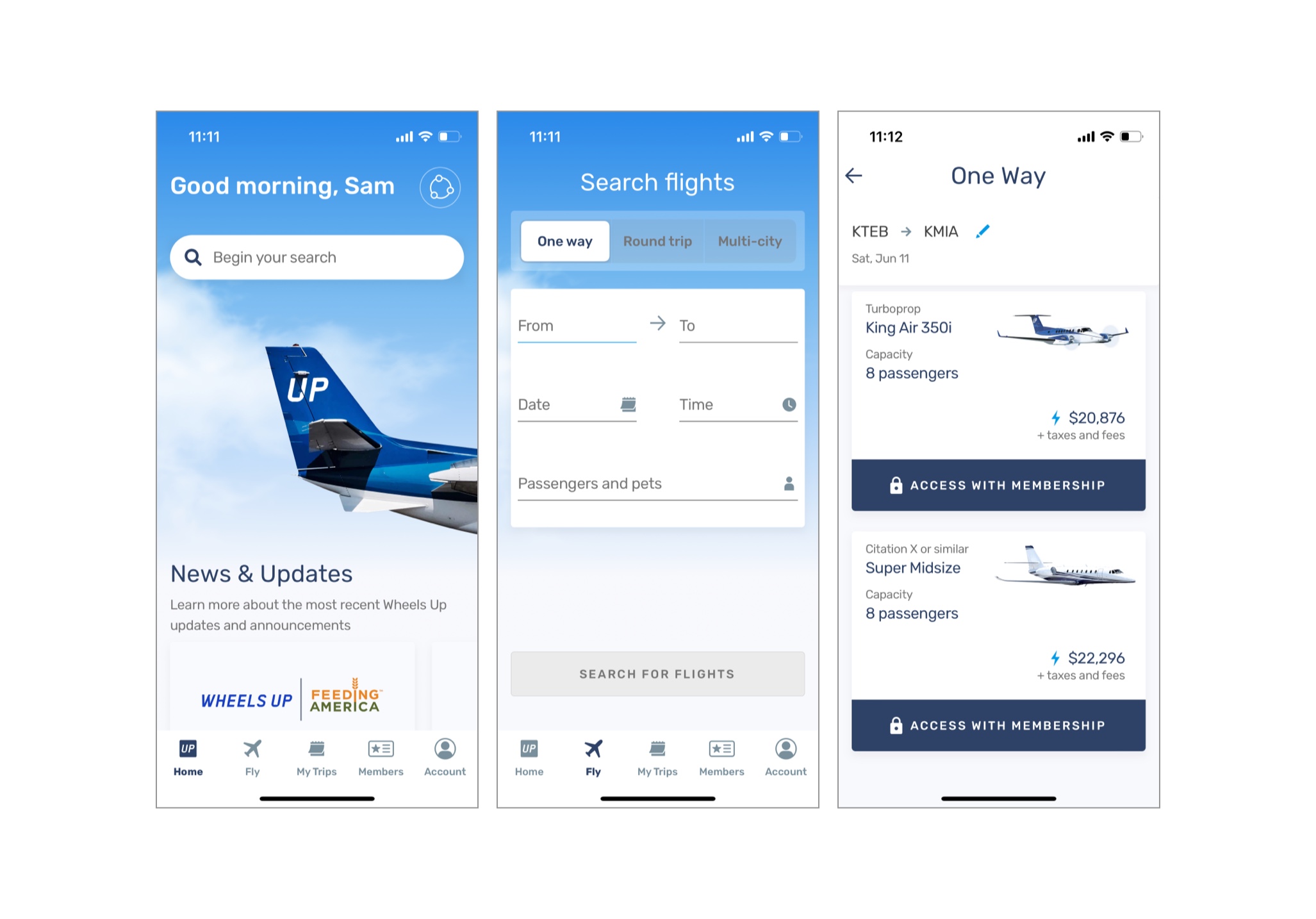
Dashboard, search screen, and search results page that were in the app when I first started.
Process
We wanted to create a free account type, so you could search and book flights without a membership. This came with its own challenges. For starters, we wanted to make sure the people conducting searches were actual users. We also anticipated a lot of new sign-ups from people who weren't as well-versed in private aviation, so adding more educational components was also a huge incentive.
We added phone verification to the sign-up process and contextual onboarding where we could. The booking flows for our free member type had more information about what was being booked, with added FAQs around what was feasible for them as a flyer.
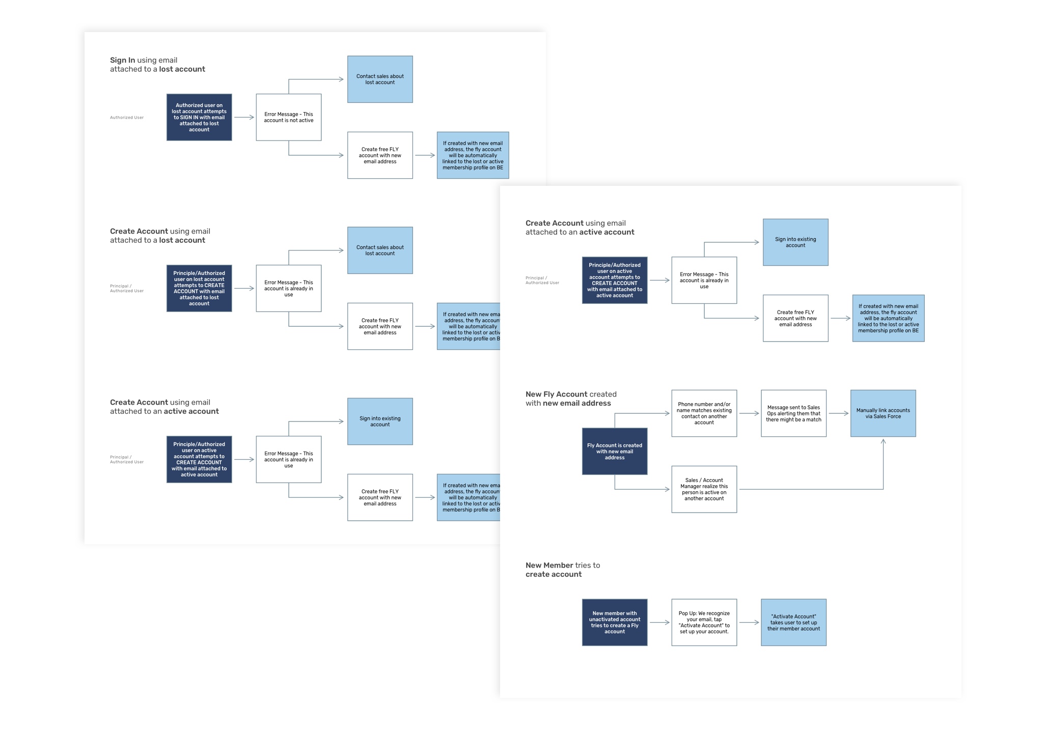
Working through different account states for the sign-in screens, to help give more clarity around what we needed to show and advise the user to do based on their situation. Because there was no "sign up" process at the time, we needed to accommodate any members who already had an account that might've been trying to sign in through the wrong page.
Solution
We started by making small tweaks to the current app, and I was placed as design lead in creating a new free user type so people could access the app and book flights without purchasing a membership. This involved creating a sign-up flow. We also added analytics with mixpanel to get a better understanding of where people might be having trouble in our experience.
I worked closely with the PMs to create KPIs that aligned with the requests of our stakeholders, as well as the lead engineers to design something feasible and modern. I presented our updates to them regularly to get feedback and insight on our decisions.
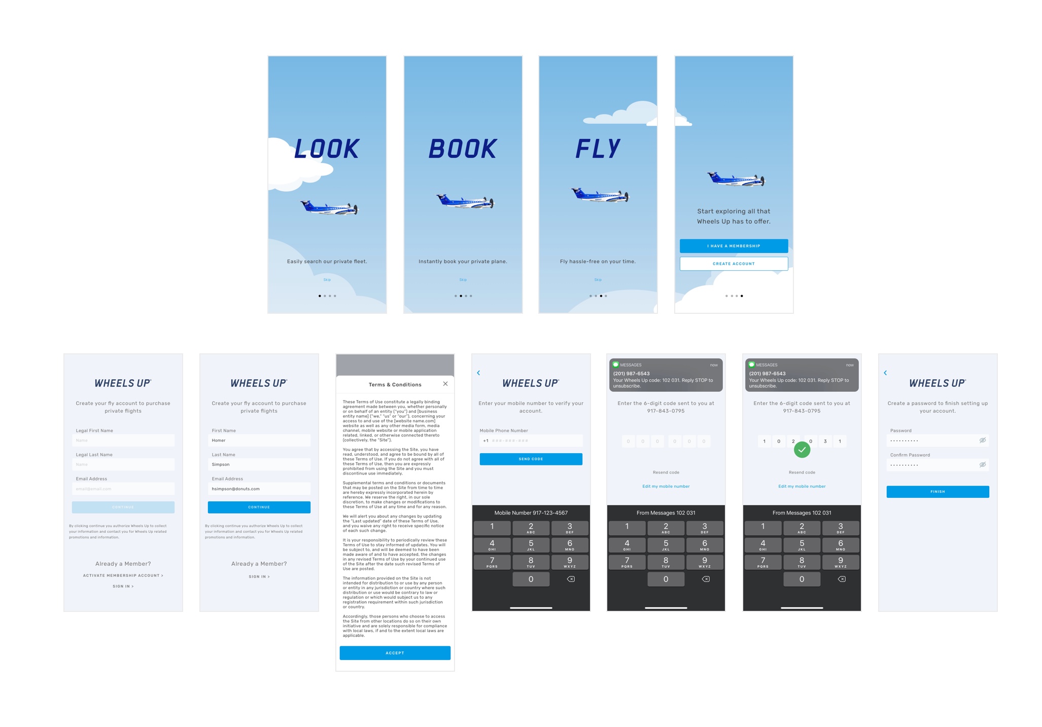
Final designs for my Sign Up flow. We added the onbaording screens to help new users who might not be as familiar with our process and the world of Private Aviation, and I created lottie animations for some of the interactions.
User testing
In 2020, we joined usertesting.com so we could test more frequently and get feedback quicker. Because we were creating a free account type, it was our hope that more people outside of our typical demographic would be signing up. The app is quite heavy with aviation jargon, so we started by testing language in our screens. Also, because users are unable to purchase a membership through the app, so it was important that we showed comprehensive membership comparisons that could drive them to our sales team for signup information. I designed a few screens and flows to test through the site.
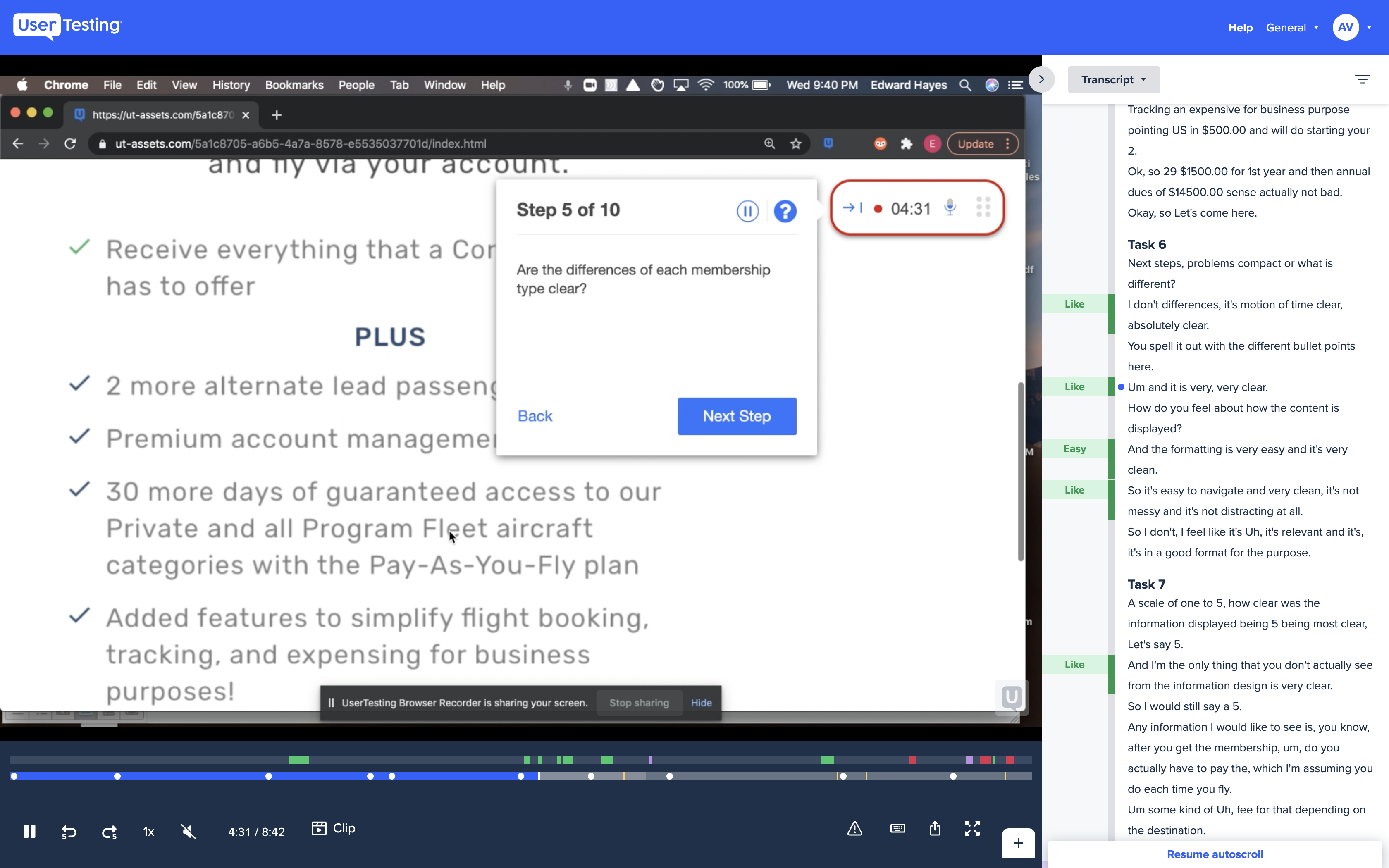
Usertesting.com still from our membership comparison screens.
Outcome
Just a couple months of launching beta with the free account option, we had almost 2,000 new accounts created, ~3% led to new member accounts.
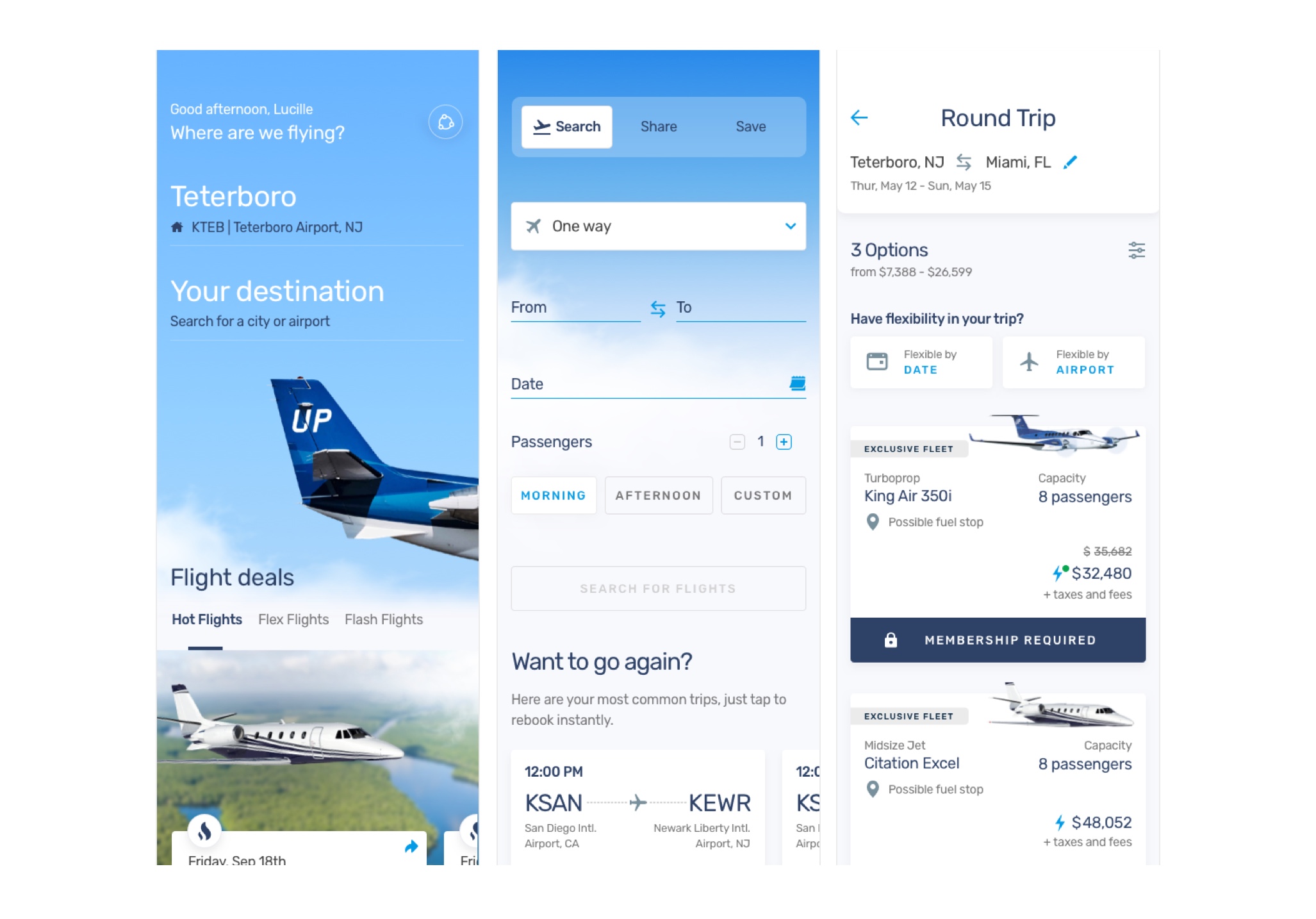
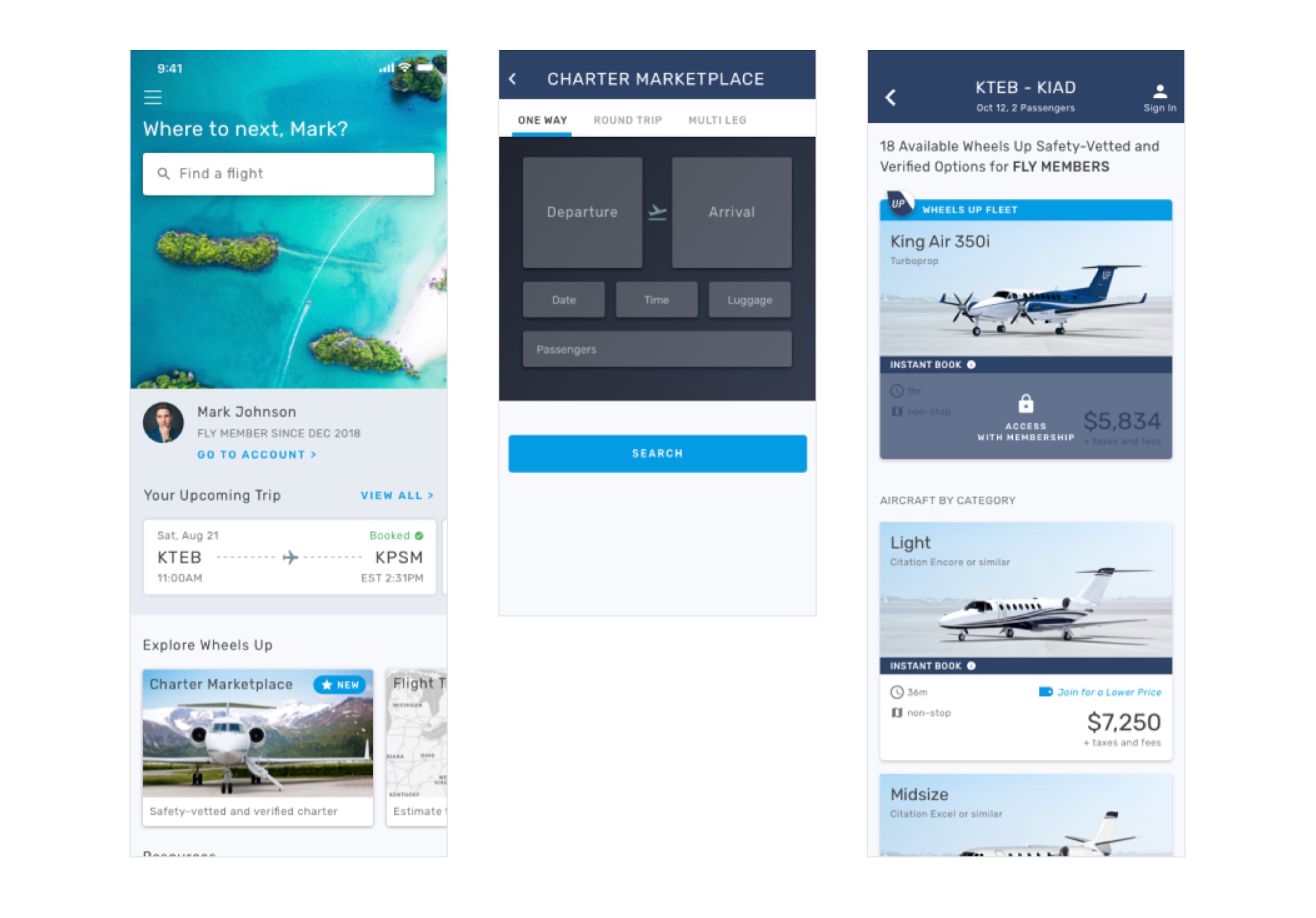
Designs for the dashboard, search, and search results pages from the redesign, and screenshots from the app. The hamburger menu has been consolidated into a tabbed navbar, and our flight cards received a massive facelift.
Redesign
Our team was only two designers and a creative director when the redesign first started, so we enlisted the help of Fantasy to help us through the research and wireframing stages of our project. Our team planned to rebuild and redesign the app from the ground up, including the dashboard, flight booking experience, account management, and membership pages.
A new VP of UX joined the team, and I was able to hire three junior designers and a UX Researcher. I took the wireframes from Fantasy and, working closely with our PMs, reframed them for an MVP release, and created high-fidelity wireframes to hand off to the rest of the team. Our small team was supporting five full-stack engineering teams.
All the while, I collaborated closely with the lead engineers to identify and build reusable components for a full design system. It was really important for us to be on the same page for every step of the process, not only using the same elements but also the same labels for all our type styles, colors, and UI components.
New design system
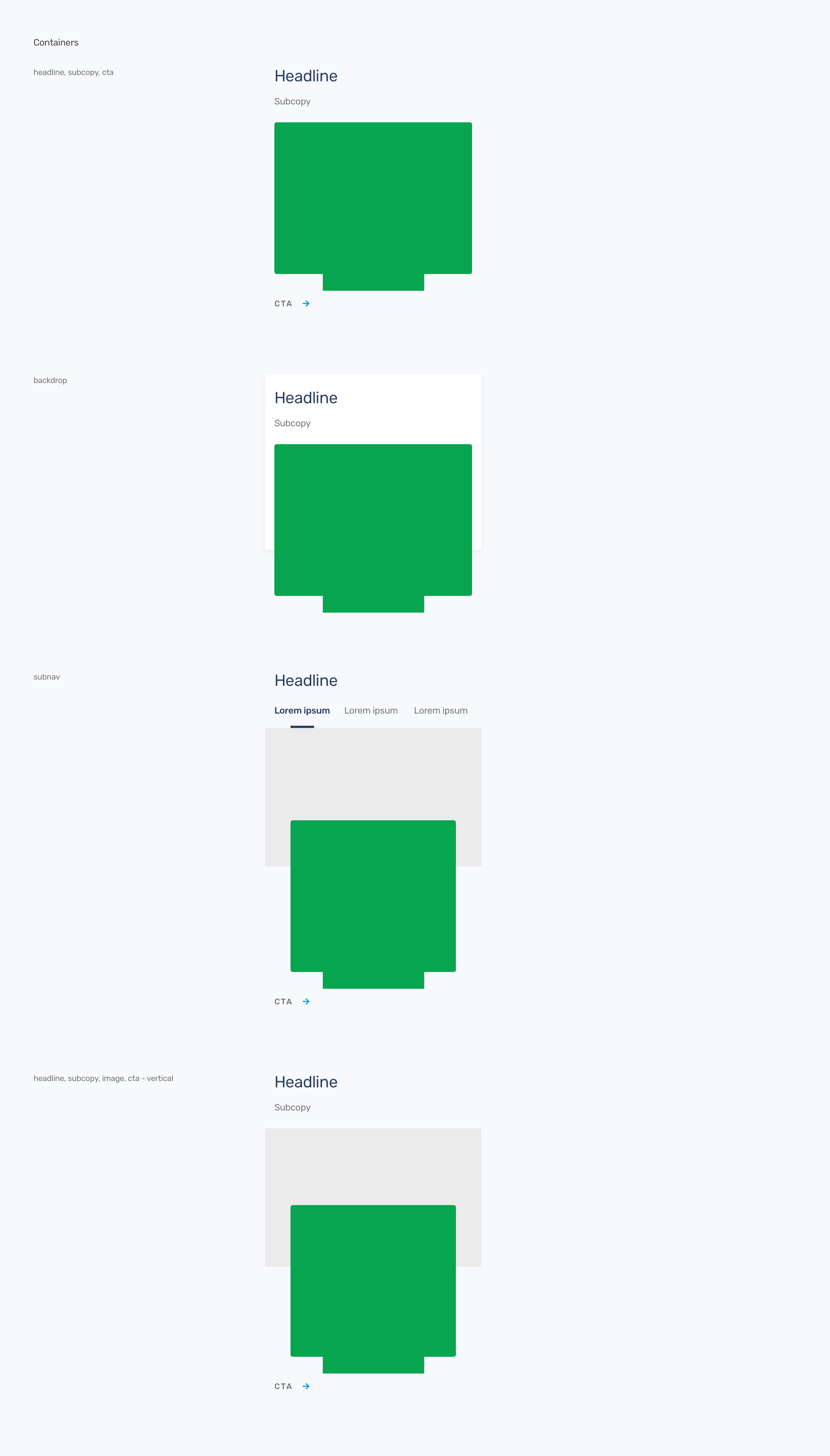
As an atomic system, we've been breaking down components with the engineer leads. In this example, we have our container molecules, which can hold card or carousel molecules (as represented by the green). This was handed off to the devs to build.
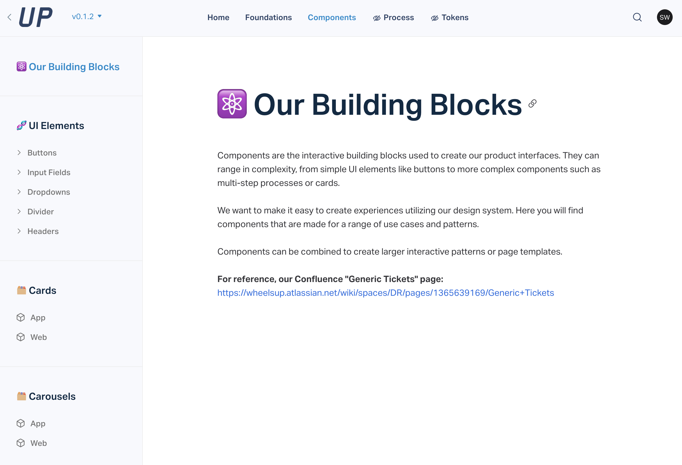
Our design system lives in a website to be easily accessable and useable by our engineering and marketing teams. It includes documentation and detailing from the acceptance criteria in our tickets, how to use each component and where, along with visual examples of the system.
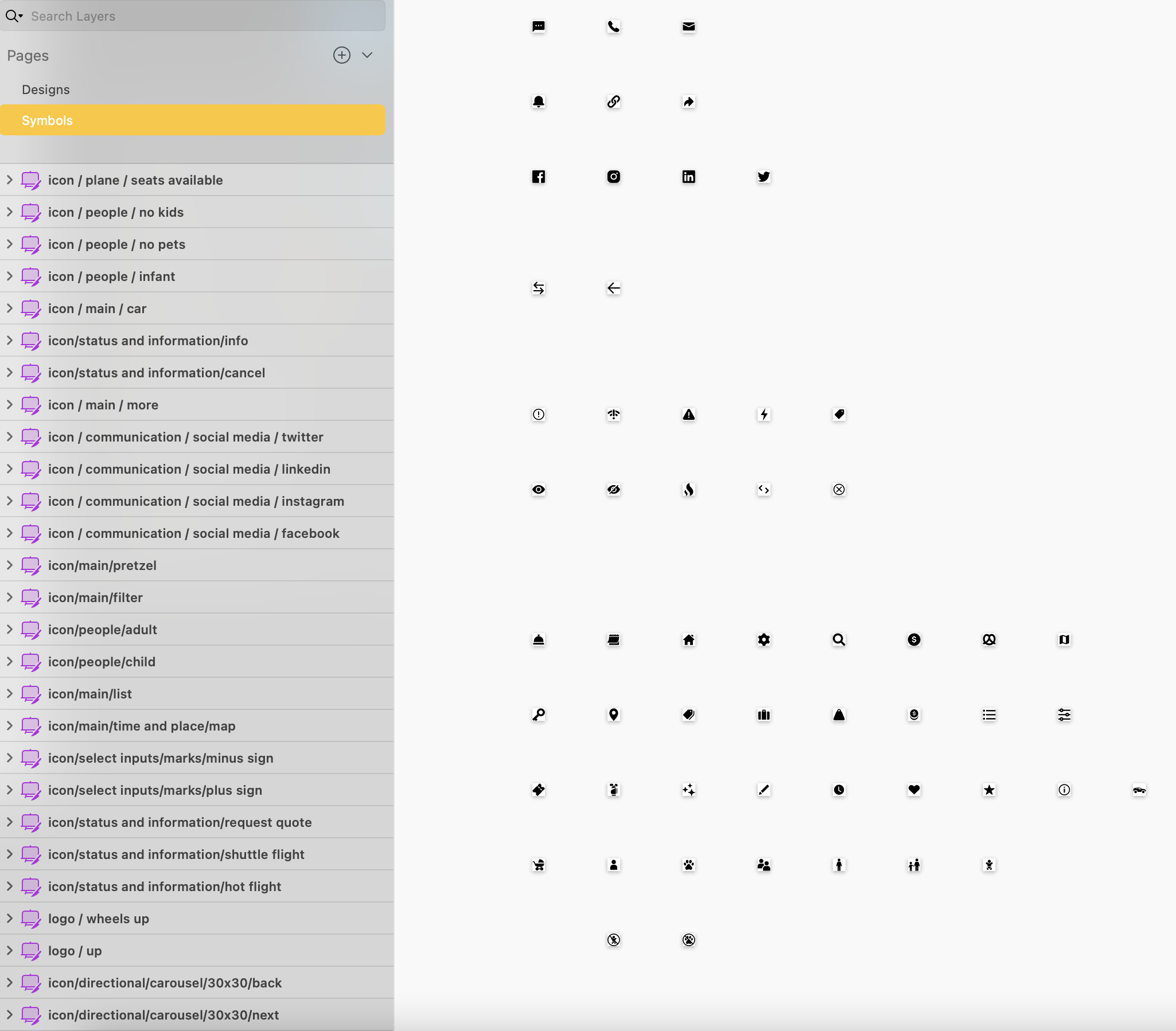
Our new custom icon library.
This information is confidential and is not to be shared or acted upon.
